For Those About to Rock - An AC/DC Tribute
Branding / Logo Design / Photography / Graphic Design
2025 - 2026
Challenge
Local AC/DC tribute band, For Those About to Rock, needed a distinct visual identity that communicated their connection to the iconic rock group. The challenge was to develop a recognizable brand that captured the energy and attitude of AC/DC while creating a variety of imagery for use across social media and promotional materials.
Deliverables
Recognizable logo, energized, vintage-inspired event banners, and impactful photography that channels classic rock nostalgia and attitude.
Research
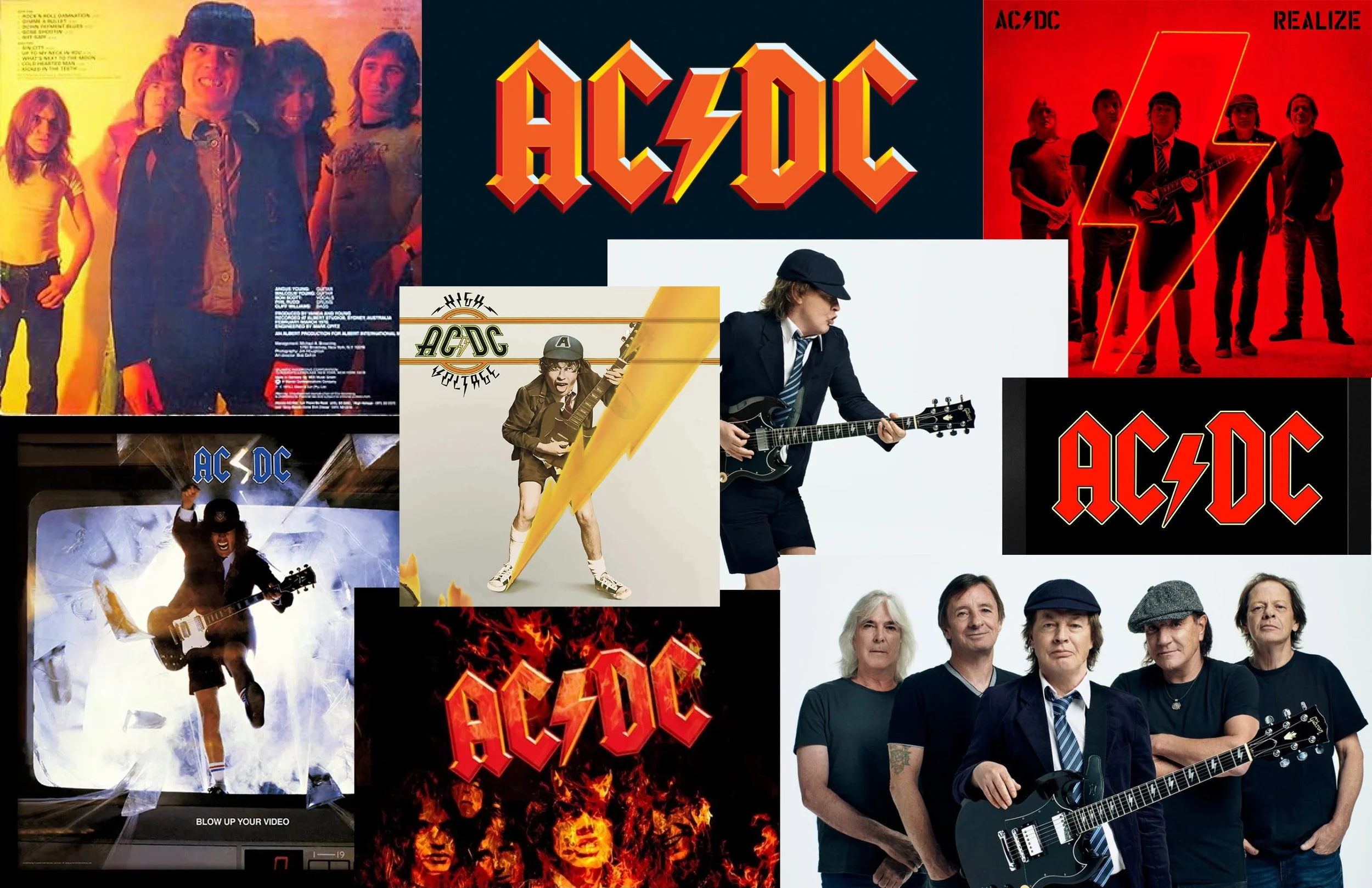
We started by creating a mood-board, studied AC/DC’s logo in depth, and reviewed their album covers and posters to understand the overall feeling, style, and visual language of the band. This helped identify key elements, such as the recognizable font, the use of the color red, and the visual representation of electricity, which we could apply so the client’s branding clearly and instantly communicated that they are a tribute to AC/DC.
Design
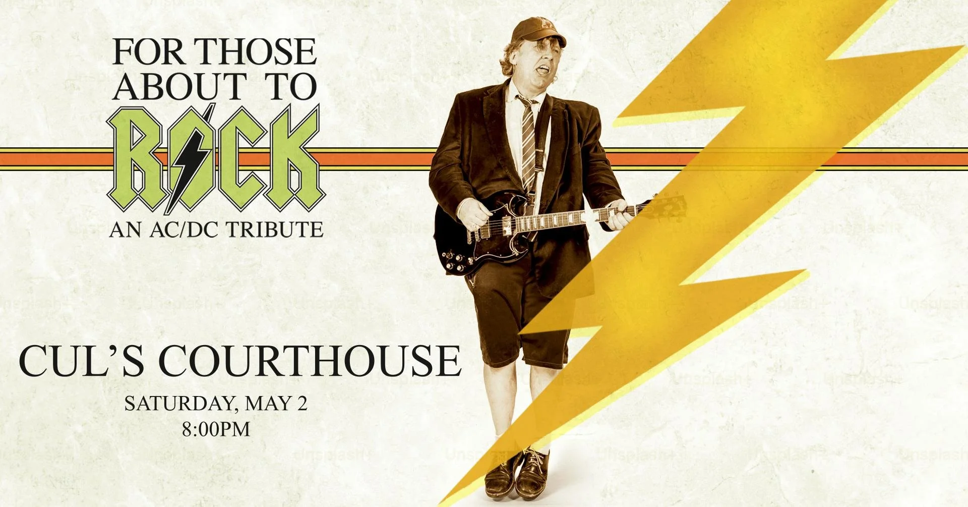
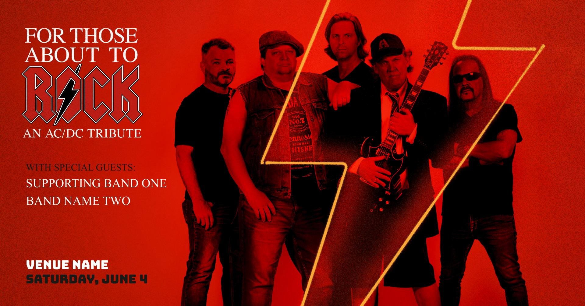
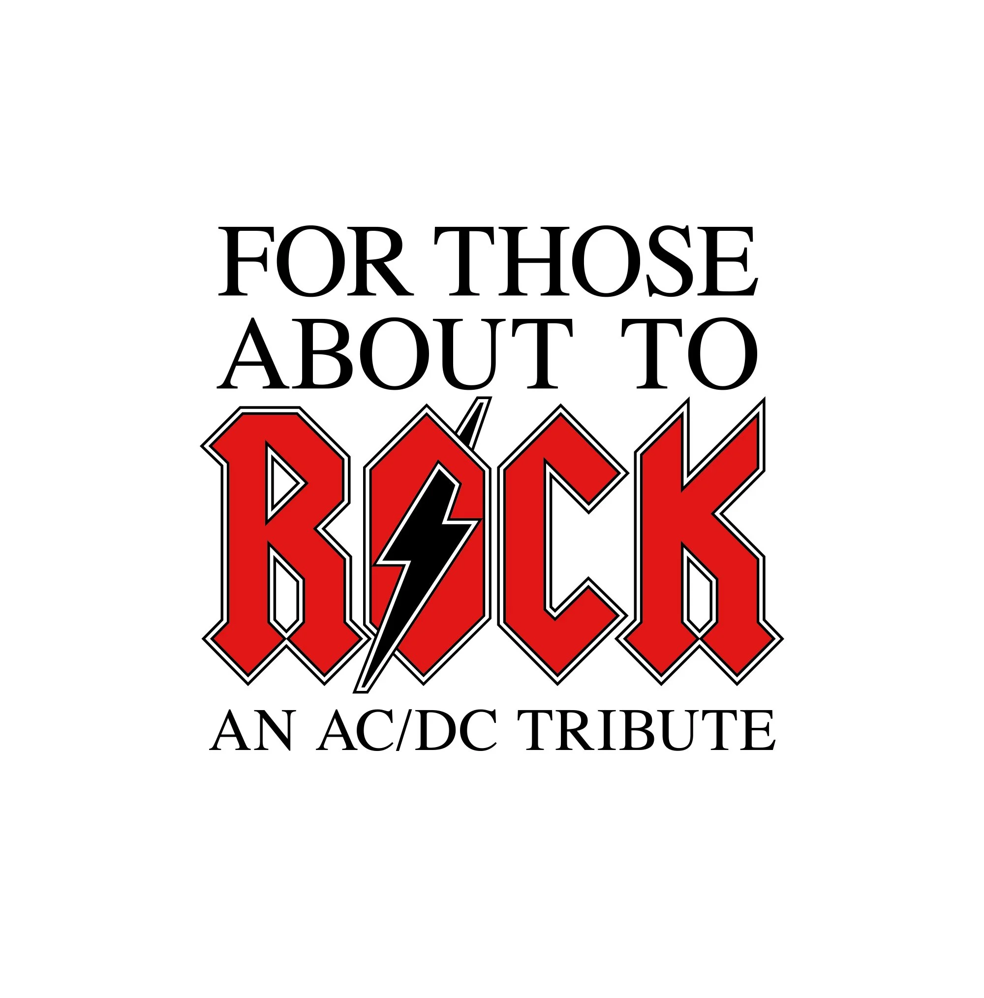
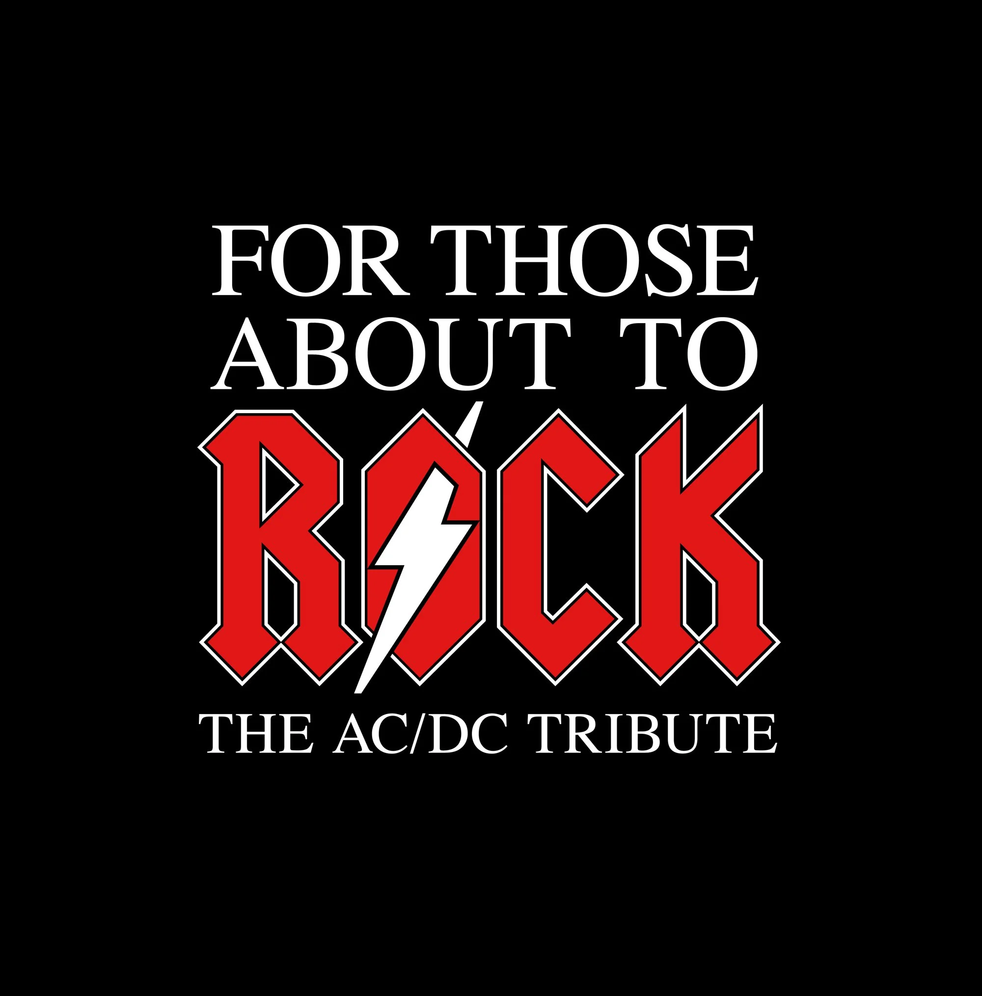
For the final design we chose to stack the text to keep the logo compact. We wanted to incorporate AC/DC’s recognizable red font, while also keeping a relatively small footprint, so we opted to make the word “rock” stand out, and used a legible and vintage inspired serif font for the remaining text. When implementing the lightning bolt, having the graphic become the center of the “O” felt like an obvious choice, paying homage to the inspiration logo, and energizing the new logo with a bold impact. Below, two social media event banners were designed to mimic AC/DC album covers, helping the band market themselves as an obvious AC/DC tribute. They were added to Google slides to allow the group members to easily change and update their event location, date and time.
Photography
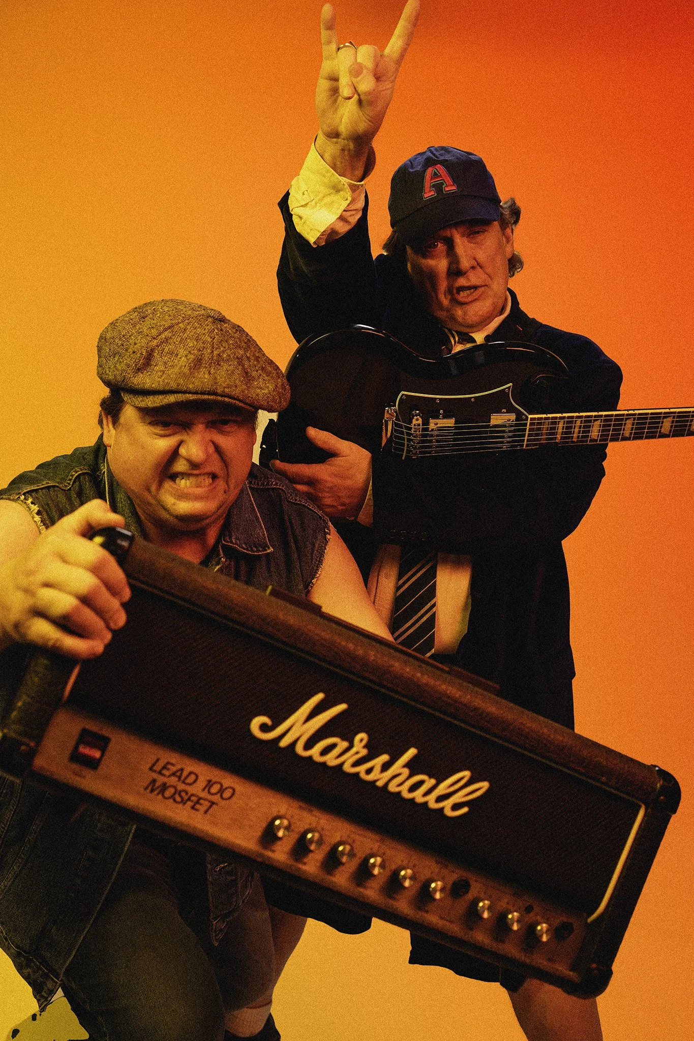
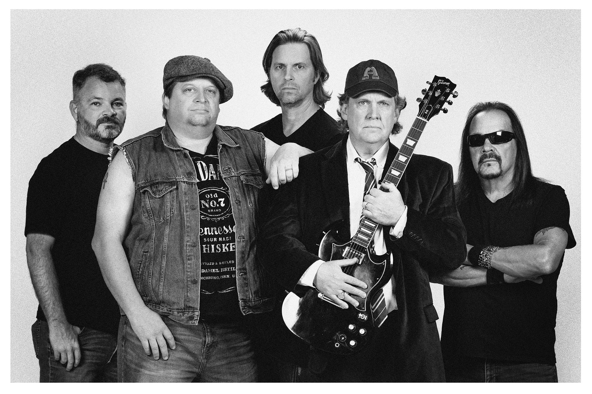
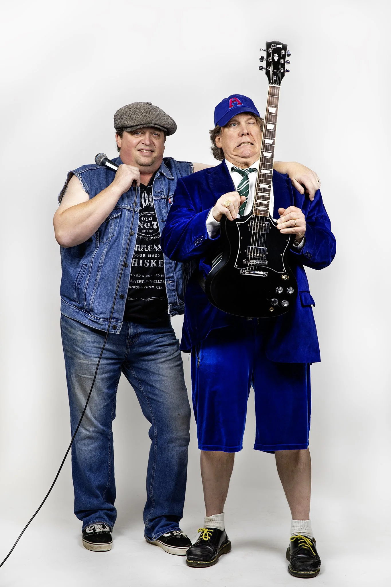
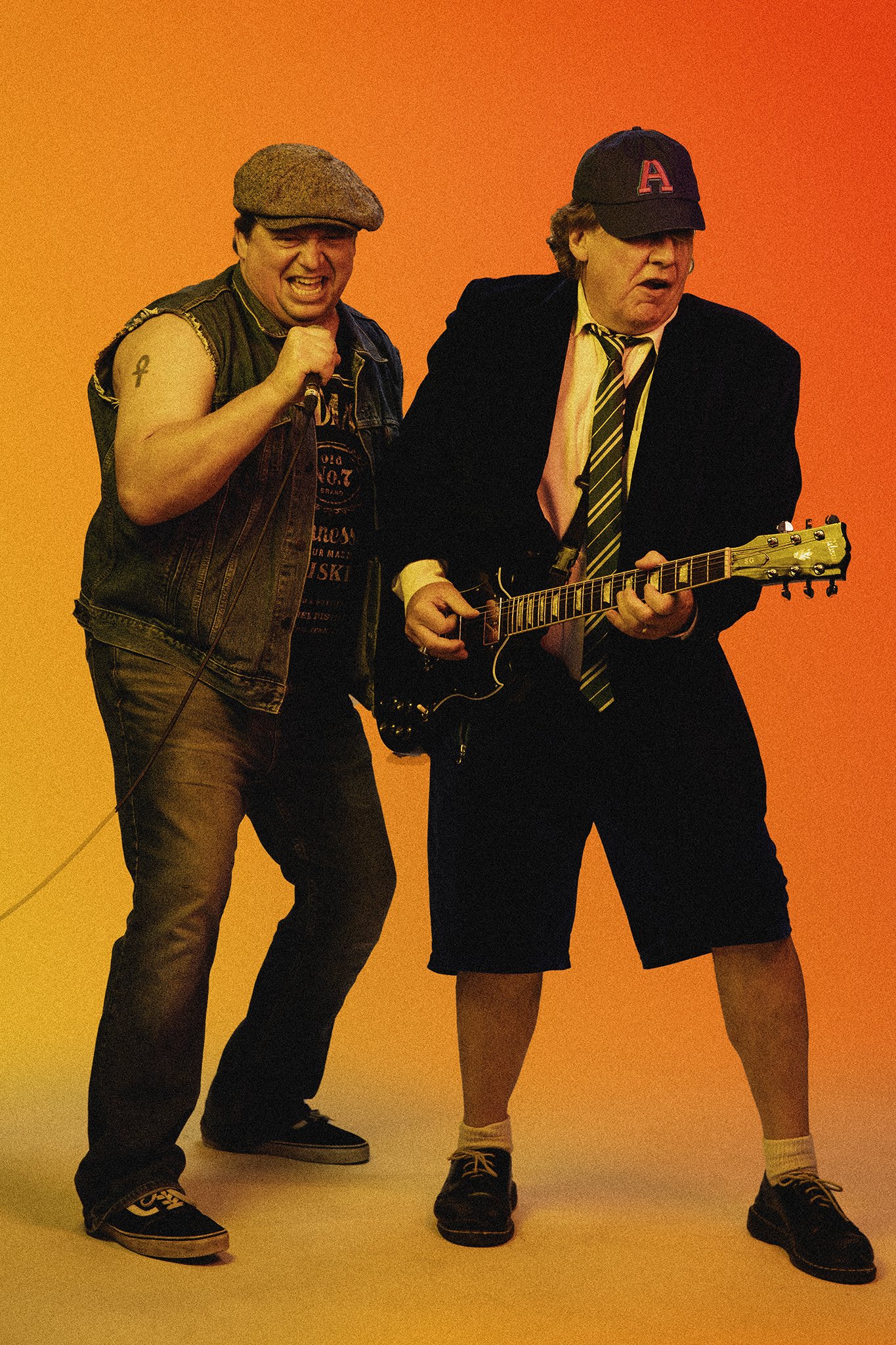
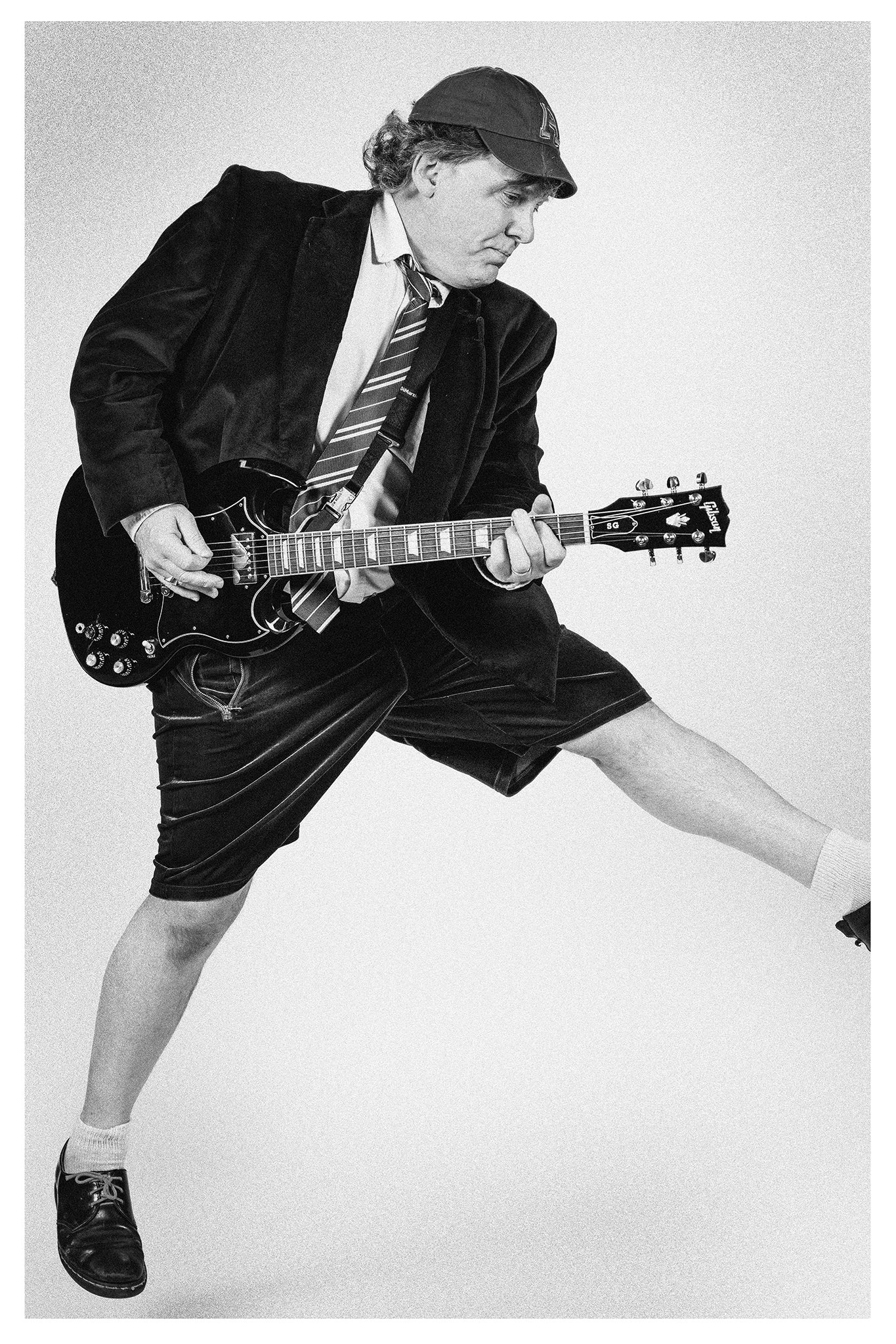
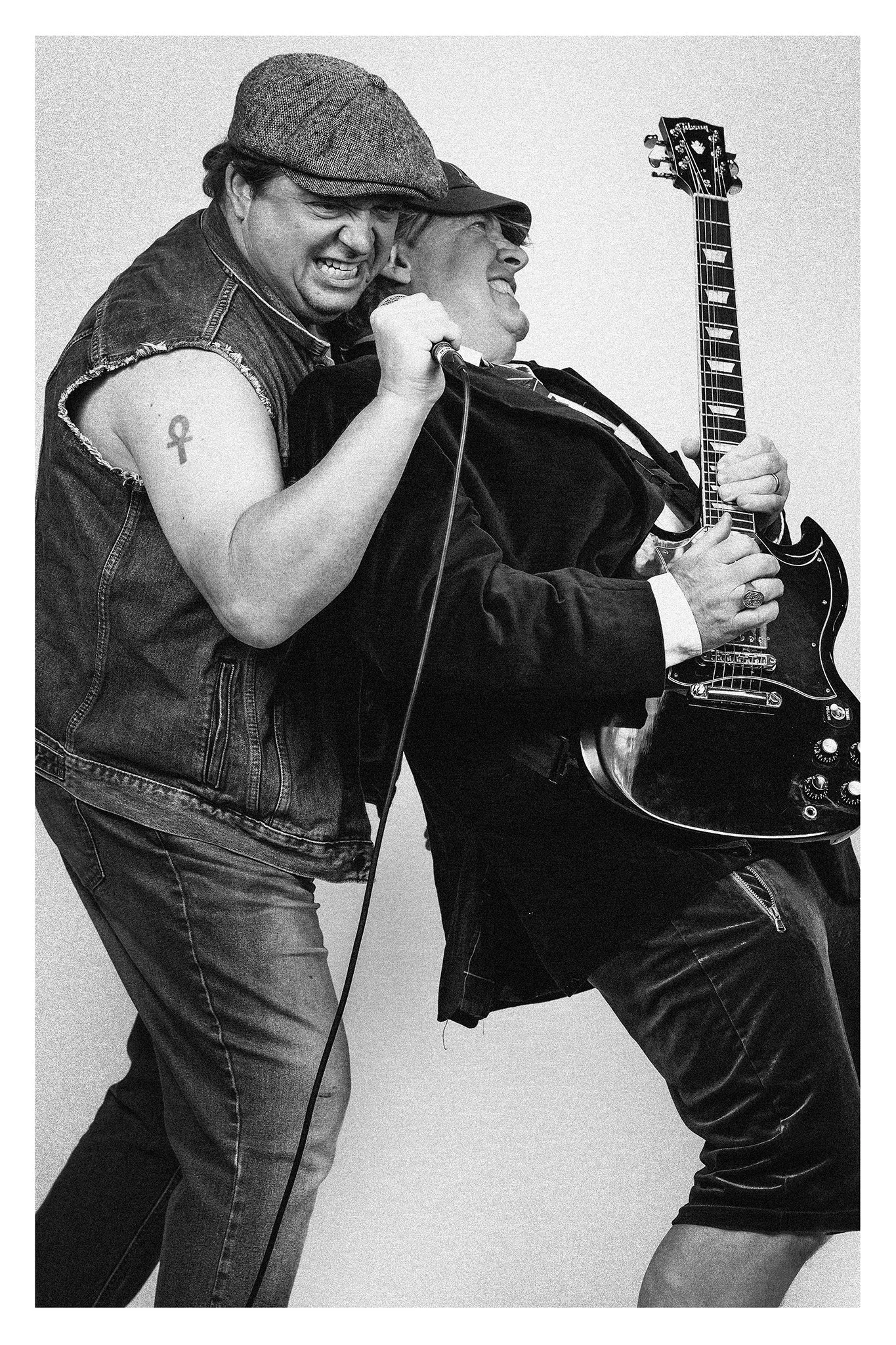
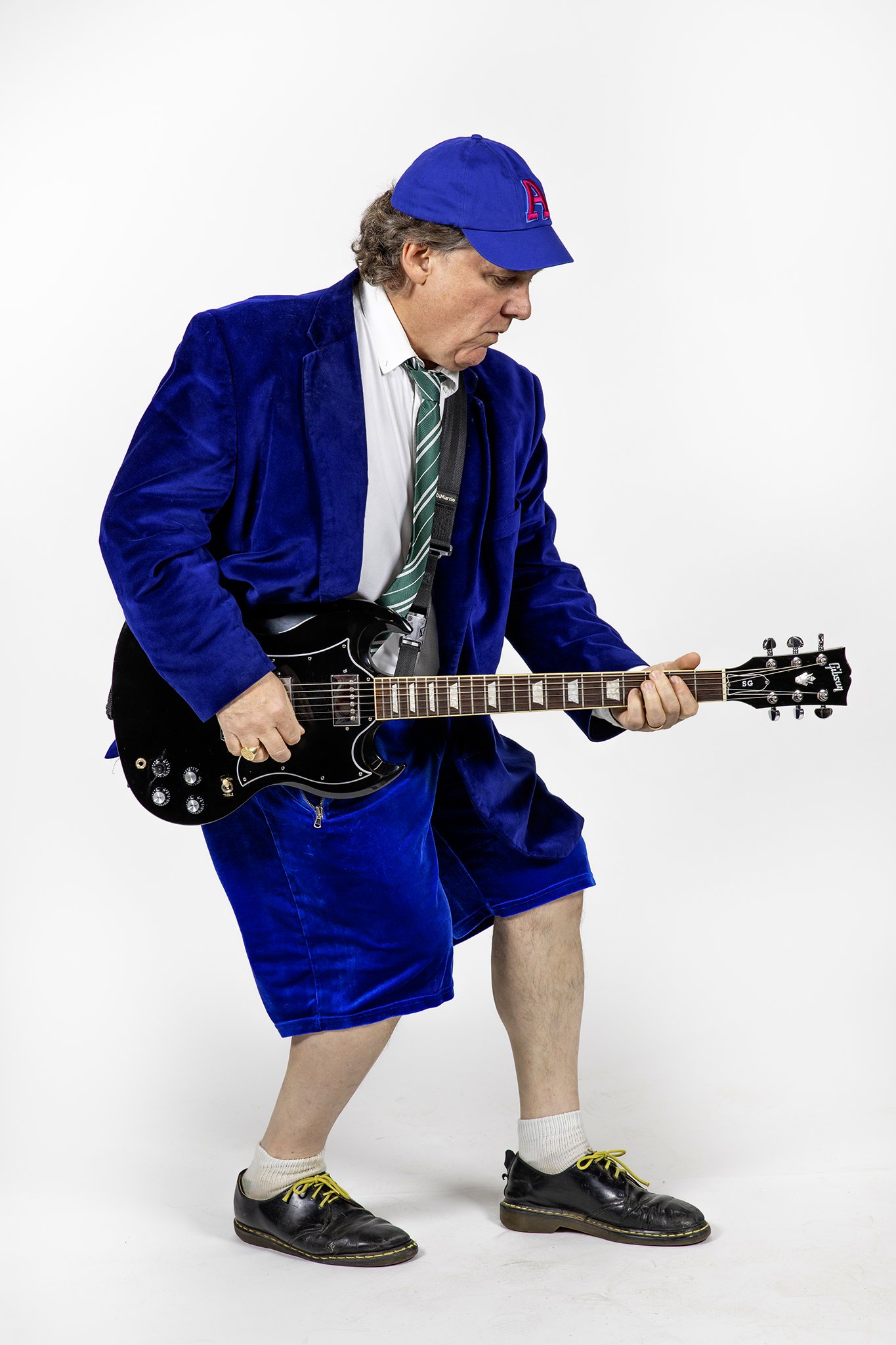
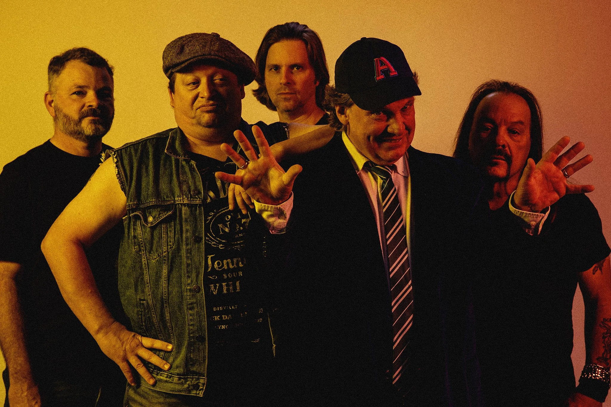
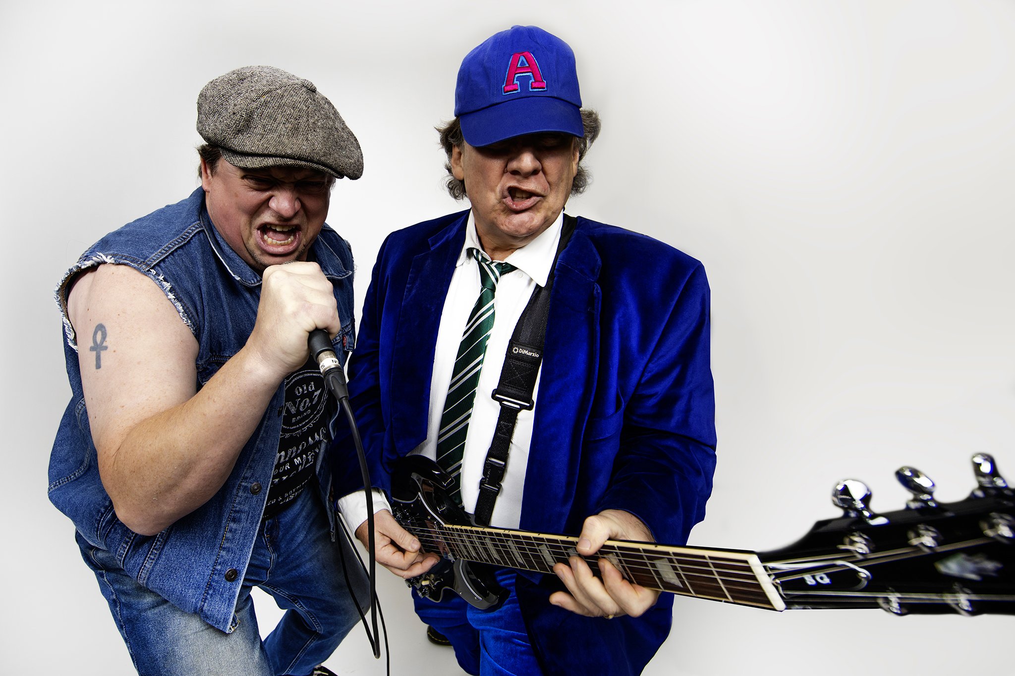
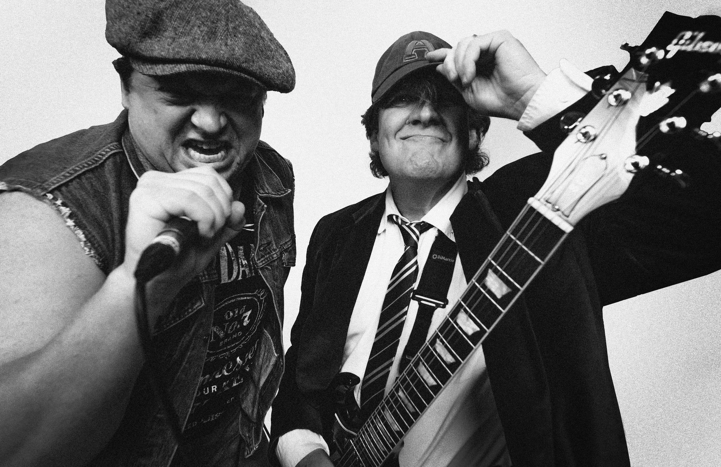
Very much inspired by AC/DC photoshoots of the past, we paid homage to the iconic images many fans instantly recognize. Red-drenched studio group portraits, as well as classic black and white studio portraits were taken. To reinforce the vintage aesthetic, images were treated with subtle texture and blur, and, in select cases, white borders to emulate the character of analog photography. Colored gels were used to re-create the sunset gradient lighting that famously dons the back of one of their most popular albums. Props, jumps, and instruments were used to create movement, energy, and attitude, while showcasing their personalities.